THE MIND BLOWING SECRETS HIDDEN IN WORLD FAMOUS LOGOS THAT YOU HAVE BEEN LOOKING AT YOUR ENTIRE LIFE WITHOUT EVER NOTICING THE TRUTH
The world we inhabit is saturated with visual data, a constant barrage of symbols, colors, and shapes designed to capture our fleeting attention. We move through our daily routines—commuting to work, ordering lunch, and grabbing snacks—while being surrounded by iconic imagery that we feel we know intimately. However, the truth is that most of us are only skimming the surface of reality. Behind the familiar faces and bold lettering of the world’s most famous brands lies a hidden language of subconscious messaging. Designers spend thousands of hours meticulously weaving secret stories and psychological triggers into these graphics, creating a silent dialogue between the brand and the consumer that bypasses the conscious mind entirely. These details are hiding in plain sight, waiting for someone to pause long enough to truly see them.
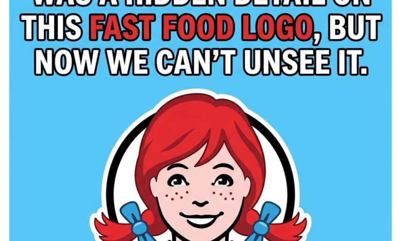
Take, for instance, the freckle-faced mascot of Wendy’s. The red-haired girl with her signature pigtails has been a staple of the fast-food landscape for decades, representing a brand built on the promise of old-fashioned quality. Most people look at the logo and see a charming, nostalgic illustration. But if you focus your gaze on her ruffled collar, specifically the area just beneath her chin, a word begins to materialize out of the blue lines and shadows. The ruffles are strategically shaped to form the word MOM. This is not a happy accident or a coincidence of graphic design; it is a calculated effort to bypass your critical thinking and tap into your deepest associations with comfort, warmth, and home-cooked reliability. By subtly embedding the word for the ultimate caregiver into the image, the brand reinforces a feeling of safety and domestic care that makes the dining experience feel less like a commercial transaction and more like a return to the family kitchen.
This psychological manipulation through design is a cornerstone of modern branding. It’s about creating an emotional resonance that words alone cannot achieve. When you walk into a Subway sandwich shop, you are greeted by a bold, yellow and green logo that has remained largely consistent for years. At a glance, it is simply the name of the franchise. However, look closer at the S and the Y that bookend the word. They aren’t just letters; they are arrows pointing in opposite directions. These arrows are a silent nod to the frantic, high-speed movement of a literal subway system. They represent the flow of people entering and exiting, a visual metaphor for the fast-paced, “on-the-go” lifestyle of the modern consumer. The logo promises that while the world around you is moving at breakneck speed, the brand is moving right along with you, providing a quick and efficient fuel source for your journey. It is a symbol of motion disguised as a name.
The depth of these hidden narratives extends far beyond the borders of the United States. In the realm of international confectionery, Toblerone stands as a titan of Swiss heritage. Its distinctive triangular packaging and mountain-peak logo are recognized globally as symbols of high-quality chocolate. Most consumers see the mountain and immediately think of the Swiss Alps, which is exactly what the brand intends. Yet, there is a much more specific story buried within the crags of that illustrated peak. If you study the white space on the left side of the mountain, the silhouette of a standing bear emerges from the rocks. This is a brilliant tribute to Bern, Switzerland, the city where the chocolate was first created. Bern is famously known as the City of Bears, and the animal is featured prominently on the city’s coat of arms. By hiding a bear within the mountain, the designers have created a nested mystery that rewards the observant consumer with a piece of local history, grounding the brand in a specific time and place while maintaining its global appeal.
These design choices represent a masterclass in the art of the “Easter egg.” In the digital age, we are accustomed to finding hidden secrets in movies and video games, but we often forget that the physical world is just as layered. Once you notice these details, your entire perception of the marketplace begins to shift. Logos stop being mere static markers of corporate identity and start feeling like small, interactive puzzles hidden in the fabric of everyday life. You begin to look at every storefront, every candy wrapper, and every delivery truck with a newfound skepticism and curiosity. You start to ask yourself: what else is the world trying to tell me that I’m too busy to hear?
This layer of creativity and intention adds a profound depth to the mundane. It suggests that even in the most commercialized aspects of our existence, there is a human element at work—a designer who wanted to leave a mark, a strategist who wanted to trigger a memory, and a storyteller who wanted to communicate an idea without ever speaking a word. These hidden symbols don’t change the chemical composition of the food you eat or the durability of the products you buy, but they fundamentally reshape how you perceive the brands themselves. They transform a simple purchase into a subconscious connection.
The beauty of these hidden details is that they are entirely democratic; they are available to anyone with the patience to look. In a world that prizes speed over observation, taking five seconds to analyze the curves of a letter or the negative space of an illustration is a small act of rebellion. It is a moment of mindfulness in a sea of mindless consumption. Next time you find yourself standing in a checkout line or sitting in a drive-thru, challenge yourself to ignore the noise and focus on the symbols. Look at the curves, the colors, and the spaces between. You might discover that the brands you thought you knew are actually telling you secrets about where they came from, what they value, and how they want you to feel.
The Wendy’s collar, the Subway arrows, and the Toblerone bear are just the tip of the iceberg. There are hundreds of other secrets woven into the logos of technology giants, shipping companies, and fashion houses. Some use color theory to induce hunger or urgency; others use geometric ratios to create a sense of harmony and trust. All of them are part of a silent, visual symphony that plays out every time we open our eyes. By learning to read this hidden language, we become more than just consumers; we become observers of a complex, creative world where there is always more than meets the eye. The truth isn’t buried in a vault or locked behind a password; it is right there, printed on the side of a cup or a cardboard box, waiting for you to finally see it for what it really is.