The Terrifying Symbols Hiding in Plain Sight: The Secret Messages Your Favorite Brands Don’t Want You to Know
You think you know the world around you, but you are actually walking through a carefully constructed hallucination designed to manipulate your brain. Every time you glance at a billboard, scroll past a product, or open your wallet, you are being hit by subliminal commands that bypass your logic and fire directly into your subconscious. You have been staring at these logos for your entire life, blissfully unaware of the dark, hidden agendas etched into the pixels and ink. These are not just artistic flourishes—they are psychological traps. Prepare to have your reality shattered as we decode the secret symbols brands use to control you.
We like to believe that we are rational consumers, making independent choices based on quality, price, or necessity. The truth is far more unsettling. We live inside a designed illusion where every curve, color, and negative space is meticulously engineered to influence your behavior. The logo on the shirt you wear or the snack you eat is a form of high-level brainwashing, a calculated shortcut designed to slip under your radar of skepticism and lodge itself firmly in your memory. These symbols do not just identify a brand; they speak to the primitive parts of your brain that prioritize comfort, hunger, status, and belonging.
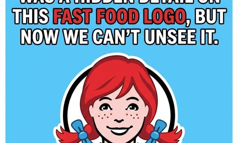
Consider the case of the Wendy’s logo. For years, the casual observer saw nothing more than a cute, stylized illustration of a young girl. But look closer at the ruffled collar of her dress. Do you see the letters? The design subtly spells out “MOM.” This is no accident. It is a psychological trigger intended to evoke the warmth, safety, and nourishment associated with a mother’s cooking. It bypasses the fact that you are eating at a mass-market fast-food chain and replaces it with the emotional security of a home-cooked meal. It is an emotional shortcut, a clever bit of branding sorcery that uses your own nostalgia against you to drive sales.
Then there is Subway. At first glance, the arrows on the S and the Y seem like standard graphic design choices intended to add a sense of dynamic energy to the brand. But look at their direction. They are designed to convey urgent motion, a psychological nudge that encourages the customer to move quickly, to grab their food, and to keep going. It is a subtle command to the busy individual that the brand is efficient and fast, aligning perfectly with the frantic pace of modern life. It tells your brain that eating here won’t slow you down; it will fuel your next move.
The Toblerone logo is perhaps one of the most famous examples of negative space engineering. The brand is inextricably linked to the Swiss Alps, which is why the Matterhorn is integrated into the mountain illustration. But look inside the mountain. There, standing proudly, is a dancing bear. This is a nod to Bern, Switzerland—the “City of Bears”—where the chocolate was first created. While this may seem like a charming bit of heritage, it functions as a “sticky” element. The human brain is hard-wired to look for hidden patterns, especially faces or figures. Once your eyes recognize the bear, you have formed a deeper, more personal connection with the brand. It is a “reward” your brain gives itself for finding the secret, and that tiny hit of dopamine makes the chocolate taste just a little bit better the next time you see the package.
These are not cute coincidences or the quirky hobbies of bored graphic designers. They are high-level psychological strategies. Companies spend millions of dollars on research to understand how different visual stimuli affect your decision-making. They know that if they can create a visual puzzle, you will spend more time looking at their product. They know that if they can tuck a subconscious, positive association into a simple shape, you are more likely to prefer their brand over a competitor’s that lacks that deeper layer of meaning. You are being manipulated by “emotional shortcuts” that bypass your rational mind and land directly in your wallet.
Yet, there is a strange, empowering secret buried within this design manipulation. Every single one of these hidden symbols is proof that a human hand was there first. A person—a designer, a strategist, an artist—made a deliberate choice to weave a story, to create a hidden layer, and to try to move you without uttering a single word. These logos are not naturally occurring phenomena; they are the result of intense human intent. When you begin to slow down and really look at the world around you, you reclaim a fraction of your power. You cease to be a passive target of advertising and start to become an active translator of your environment.
When you start decoding the negative space, recognizing the subtle curves, and identifying the clever tricks used by marketers, you begin to see the illusion for what it is. You start to understand that the world is being constructed for your consumption. This realization is your armor. By becoming a translator of branding, you can decide which messages actually deserve to stay in your head and which ones are just noise. You can choose to be aware of the “emotional shortcuts” rather than falling for them.
The next time you see a familiar logo, don’t just look at it—interrogate it. Ask yourself what it is trying to make you feel. Is it trying to make you feel nostalgic? Is it trying to make you feel like you are part of an exclusive club? Is it trying to make you feel safe, or fast, or powerful? By asking these questions, you strip the logo of its subconscious power. You see the human hand behind the curtain, and in that moment, the illusion loses its hold on you. The world may be filled with calculated design, but you don’t have to be a pawn in the game. You are the audience, the interpreter, and finally, the one who decides what stays and what goes.